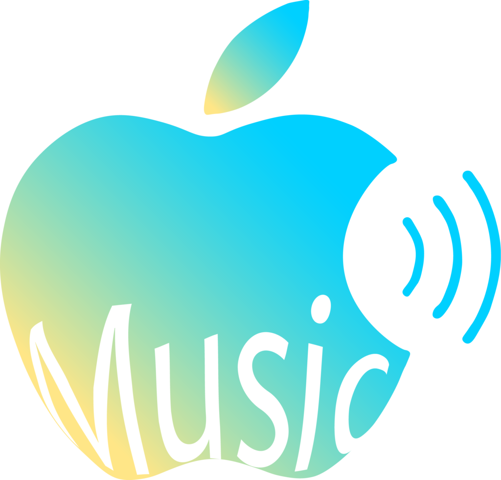
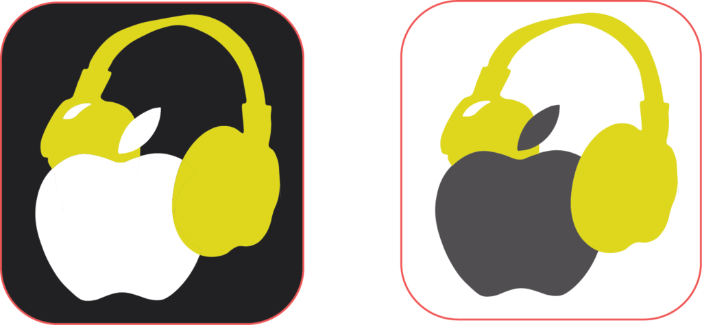
In a semester’s time, I’ve completed eight projects in JOUR 3380: Introduction to Digital Design, and while I can certainly say that my understanding of design fundamentals is more evident in later projects, I still have a fondness for the first one I completed. We were tasked with recreating a logo and redesigning it in two ways, and I chose to work with the Apple Music logo. As someone who’s very familiar with Apple’s branding, I wanted to redesign the logo in a way that didn’t stray too far away from the minimalism and uniformity of Apple’s designs, but I also wanted to engage younger audiences (especially since they are more likely to prefer Spotify). Hence, why I created two designs that utilize color and new visual elements (alongside the signature bitten apple) in a playful way. This project marked my first foray into using Adobe Illustrator, which was initially a bit tricky to get the hang of, but after some experimentation, I found quite a fun tool and one that I want to continue using.