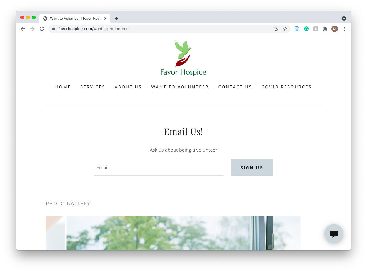
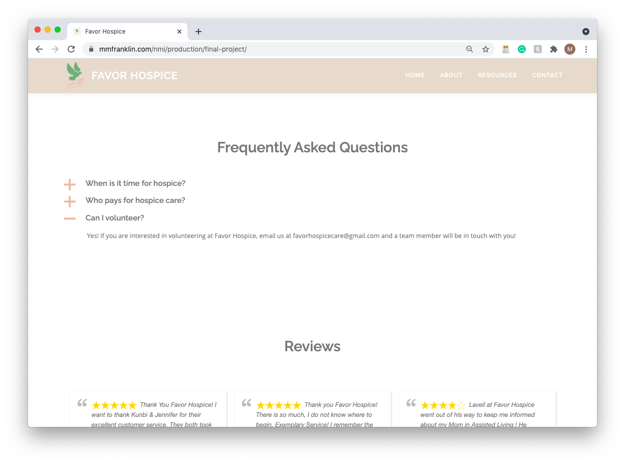
Alright, that’s enough about the challenges, let’s talk about the achievements (of which there are many!). I’m really proud of my ability to consolidate and rearrange the information from the original website. I think that by taking things that were standalone pages on the original and integrating them into other ones (i.e. the volunteer page), I reduced clutter on the menu and streamlined the website’s content. I’m also quite pleased with the layout of the site and the additions that I made to the content that was on the original site. For instance, I changed all of the images, rewrote the copy on the site, added an address, and updated both the site’s logo and the COVID-19 information. I believe all of these changes made the website feel more representative of the business’ mission.
Although I was redesigning the website for my stepdad’s business, he gave me complete freedom to do what I wanted, so I feel extra proud of all of the work I did because I wasn’t operating under any guidelines (although I did have to ask him for input on FAQs). While I wanted to keep true to the nature of the business, I had to add some personal touches, so that’s where my favorite element of the site comes in — the animations! I added some subtle animations on the buttons as well as the menu items, and I love the way it adds a little bit of fun to an otherwise very straightforward website.
(Before: Unnecessary volunteer page; After: Incorporated the volunteer page information into a FAQ on the homepage)


