Project Two
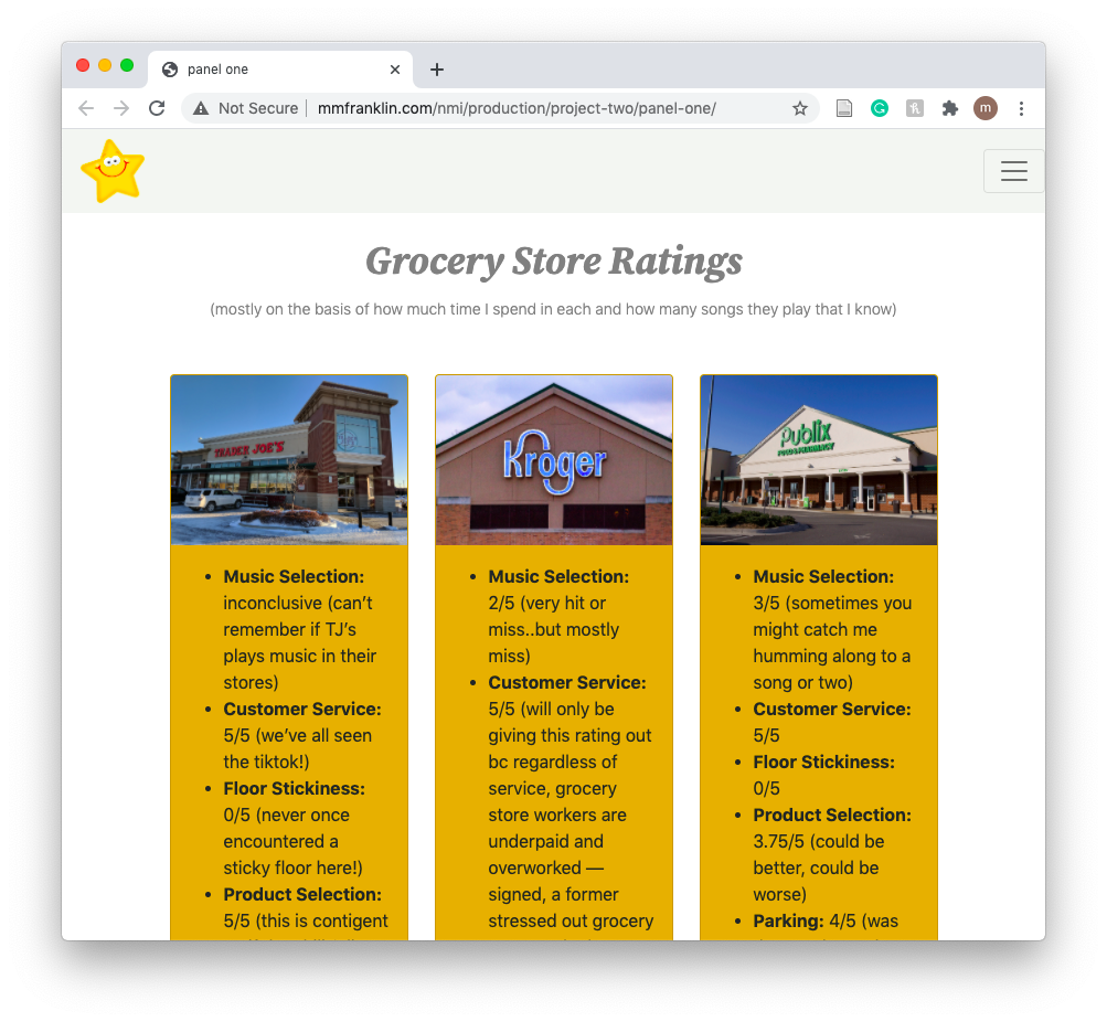
Panel One

At first, I was really nervous about working in Bootstrap because I’d felt I’d finally found my footing in regards to building a site manually. Eventually, as I began working on panel one, those nerves subsided. I managed to make the page look nearly just like the one I’d sketched out on paper beforehand. I’m particularly proud of how well I was able to handle working with the Bootstrap grid system and the overall aesthetics of the page. My biggest struggle while working on this panel was trying to get the form to be the size I wanted. I couldn’t figure out how to stop the form from stretching the entire length of the page, so that’s something I’d like to learn in the future.
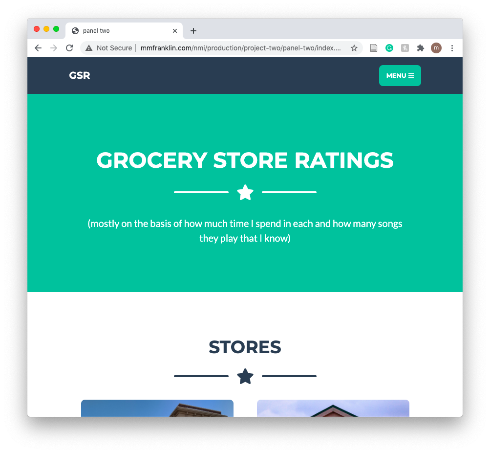
Panel Two

There’s not much to say about my experience working on this panel because I was simply taking the content from panel one and transplanting it into a ready-made theme. I don’t believe I acquired any new skills during this, but I was happy that Bootstrap has classes that are attached to different colors, so I was able to change the color of the button without using css of any kind (inline or otherwise). My biggest struggle here was not being able to use css to make the site look how I wanted, because while I liked the layout of the theme for my content, aesthetically it wasn’t my style.
Panel Three

Working on this panel was both rewarding and frustrating. I changed a great deal about the site (changed fonts, added an animation, changed the color of almost every element, added gradients, formatted the button, added a link in the footer) and I’m overall very proud that it looks distinctive from panel two, but still bears a noticeable enough resemblance. In doing these changes, though, I ran into a few challenges. I struggled with getting the animation to work for a long time, and it involved a lot of trial and error. Though I eventually got it to work, I’m certain that there was another solution, which probably didn’t involve changing the size of the section/element. Also, I struggled with finding the code responsible for the green color (it's inherent to the theme) that’s still present in the hover states of the menu and scroll to top button. I looked for the source many times using the “inspect” feature and each time, I couldn’t find it, therefore this is something I’d like to work on for future projects.